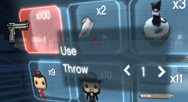
ContextColumn
A vertical column that displays a list of ContextItems above an item in the tab.
Like the Columns section, it extends BaseColumn.

Properties
| Name | Type | Access | Description |
|---|---|---|---|
IsVisible | boolean | public | Indicates whether the context column is currently visible. |
OnItemSelect | func(item, itemIndex, qttySelected, remainingQtty) | public | Callback called when a ContextItem is selected. QttySelected, remainingQtty may be nil for items without quantity. |
Methods
| Name | Parameters | Return | Description |
|---|---|---|---|
ShowColumn | INDEX:number | — | Displays the context column at the given index. |
AddItem | item:BaseItem | — | Adds a ContextItem to the context column. |
Populate | — | — | Populates the context column with all items. |
ClearColumn | — | — | Clears all items and hides the column (scaleform side only, used internally to hide the menu). |
ClearItems | — | — | Clears all the items and hides the column (both scaleform and Lua side, public to be used on need) |
GoUp | — | — | Moves the selection up. |
GoDown | — | — | Moves the selection down. |
GoLeft | — | — | Adjusts the current item’s index left (if selectable). |
GoRight | — | — | Adjusts the current item’s index right (if selectable). |
Select | — | — | Invokes the selection callback of the current item. |
Usage Notes:
- It’s automatically shown when an item is selected
- If no ContextItem is added to it, the column is not shown and item is directly selected with a OnItemSelect event fired from the tab.
- When an item is selected 2 events are fired.. context column’s
OnItemSelectevent and item’sSelectedevent.- First one is generalistic and returns the item and its index along its data, the second one is specific for the selected item only.